Poor Huckleberry Hound gets abused in a bunch of his cartoons, but he never really seems to mind. In Dragon-Slayer Huck (1958), for example, a purple dragon breathes fire in his face and smashes him into the ground with its huge tail. Cut to a close-up of Huck’s head popping out of the ground. “Leave us face it, that ol’ dragon’s got real spirit,” he says smilingly at the audience.
The cartoon’s a good one. We reviewed it here. What we didn’t do was post a bunch of Ken Muse’s impact drawings. Muse used a jagged ovalular pattern to show impact. So let’s pair up a bunch of drawings to show you what I mean. Most of these are consecutive frames. And they are self-explanatory, I think.


The dragon’s fire has burned the handle on the axe and the mace. That’s why they come crashing down on Huck.


Here’s where the charging dragon and Huck’s horse meet.

Whether this cartoon was somewhat inspired by One Droopy Knight, which Mike Lah had made at MGM when Bill Hanna and Jose Barbera were producing, may never be known. But it contains a horse-dragon collision and the king’s daughter is involved in the plots of both (although handled quite differently).
And because we haven’t posted one in a while, here’s an endless loop. The horse’s gallop cycle is four drawings (shot one frame apiece) and it takes 16 frames for Huck to reach the same grove of trees in the background.


This isn’t the same speed it is in the cartoon, but you get the idea.

Is there any doubt that Mike Maltese was the best cartoon writer of all? Not for me, there isn’t. Some of the funniest stories ever concocted at Warners Bros. were his, and he somehow managed to pump out 79 cartoons (all in the Quick Draw series and one Huckleberry Hound) in his first year after being hired at Hanna-Barbera. Variety announced on December 4, 1958 his arrival at H-B to be the head of its new story department.

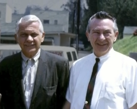
From the collection of former H-B writer Tony Benedict comes this picture of Maltese with another of the greats of the cartoon writing business, Warren Foster. Both of them were native New Yorkers, both worked for the Fleischer studio in the 1930s and it was on Maltese’s recommendation (the story goes) that Foster was hired at Warner Bros.; Maltese was an assistant animator at the time. Foster was hired at Hanna-Barbera on April 14, 1959, so it seems likely Maltese hired him there, too. Foster had left Warners in November 1957 for John Sutherland Productions.
The insightful critic John Crosby interviewed Maltese toward the end of 1959 when the Quick Draw McGraw show was on the air. We reprinted it some time ago but you can click HERE to read it.
Another indispensable interview with Maltese is in Joe Adamson’s essential book Tex Avery, King of Cartoons. We await the day when historian Michael Barrier publishes his in-depth interviews with Maltese, snippets of which appear in his book Hollywood Cartoons.
Hanna-Barbera was in the Kling Studios (the former Chaplin Studio at 1416 La Brea) when Maltese arrived but he apparently worked from home until the company opened its own building easily recognisable by fans at 3400 Cahuenga Blvd. in August 1963 (plans were announced in March 1962).
Maltese’s “The Flintstone Flyer” episode of The Flintstones, co-written with Joe Barbera and Dan Gordon, was the first to air in September 1960. His name can also be found on the first Yogi Bear Show to air in January 1961. Whether Maltese was freelancing for Chuck Jones at Warners at the time is unclear. His name can be found on “The Mouse on 57th Street,” released in 1961. It’s hard to believe the story was completed before Maltese left for Hanna-Barbera in 1958, but it is possible. Maltese was listed as a writer on “five new half-hour animation projects” for H-B (Variety, December 13, 1961). What they were is unknown. The trade paper the following September mentioned Maltese was assigned to work on The Flintstones and The Jetsons, but I don’t believe he worked on any Jetsons episodes.
It appears Maltese came and went from Hanna-Barbera several times. Variety of August 30, 1963 revealed that he would be working with Jones again, this time on the Tom and Jerry theatricals to be released by MGM. Two days earlier, the trade paper announced Norm Prescott was producing a four-part satire called “How The West Was Lost (Almost)” featuring characterisations of the Marx brothers with Maltese handling “pictorial layouts.” The project languished until February 1966 when Variety mentioned Prescott’s Filmation had found a distributor for the series, Groucho Marx would be a technical advisor, and Maltese was credited as a writer. It never did air.
Maltese was back at Hanna-Barbera in 1965, his name appears on screen as a co-writer on a Secret Squirrel/Atom Ant special, then on the Secret Squirrel Show itself. His last Tom and Jerry short for Jones was released in 1967 and his last project for Hanna-Barbera appears to have been in 1971 when he put together stories for the Funky Phantom, an unfortunate mixture of Snagglepuss and Scooby Doo. Toward the end of the decade, Maltese reunited with Jones for pale carbon copies of their Warner Bros. cartoons and, as the story goes, had his storyboard for the Duck Dodgers sequel tossed out by the director. Fortunately, Maltese lived into the era where old theatrical cartoons were written about and praised, and he was awarded by his peers before he died on February 22, 1981.
Picking a favourite Maltese cartoon, even a favourite Maltese moment, at Hanna-Barbera is pretty much impossible. El Kabong bashing a bad guy with an out-of-tune guitar, Snuffles’ self-love and leap into the sky after eating a dog biscuit (made by sponsor Kellogg’s) are things the most casual cartoon watchers of a certain age remember, even if they don’t know the writer responsible. And people still quote the line Maltese handed to Snagglepuss: “Exit, stage right.”

Here’s another shot of Maltese outside the concrete brick bunker studio at 3501 Cahuenga, where Hanna-Barbera was housed by August 1960. On the left are layout artist Dick Bickenbach and production supervisor Howard Hanson. On the right of Maltese is someone whose picture I don’t recall seeing before. He’s Paul Sommer, who was a story director at the studio. He would have been about 50 at the time this photo was taken and died in 2011 at the age of 99. The photo was provided by Tony Benedict, who was writing at Hanna-Barbera at the time.
Mike’s daughter Brenda told the Los Angeles Times in 2008: “He was always funny . . . he had charisma . . . He would walk in a room and take over . . . He took a lot of [his ideas] from our animals. We had dogs and cats, and he would pick up on anything . . . I was that obnoxious girl [in the Bugs Bunny cartoon Little Red Riding Rabbit].” (Brenda used to shout “Ta have!” as a girl. Mike put it in the story).
Wherever he got his ideas, they were brilliant at times. And he somehow coped with the huge workload at Hanna-Barbera. He really was the greatest of them all.

Did your parents buy you stuff featuring your favourite animated cartoon characters? Considering how huge the cartoon merchandising business is, the answer must surely be “yes.” And as we’ve shown in a number of posts over the years, there was no end of stuff pumped out under license by Hanna-Barbera—games, toys, comics, colouring books, records, and more.
No one’s really documented all this cartoon merchandise and collated it into one place—until now. Tim Hollis is out with a book called Toons In Toyland, published by University Press of Mississippi. I’m amazed at the sheer amount of research that had to go into writing it, and bowled over by the number of delightful photos of toys, records, and so on. There’s at least one picture on almost every page. You’ll see stuff that if you didn’t have it as a kid, you may want it now. The book is worth it just for the pictures alone.
The Hanna-Barbera studio got started in 1957 with financial help of the family that owned Columbia Pictures. As a result, Columbia/Screen Gems had all kinds of marketing rights to the first Hanna-Barbera characters, all managed out of New York City by a chap named “Honest” Ed Justin. Tim will tell you a bit about him. You’ll learn about the start of the Jellystone theme parks (with exclusive pictures), Yogi Bear Honey Fried Chicken restaurants, and how H-B characters came to be in comic books, on records, and in vitamin bottles.
And, no, the book doesn’t focus only on Hanna-Barbera. You can see and read about putting the Peanuts gang, Popeye, Bullwinkle, Woody Woodpecker, Mr. Magoo and many others in the merchandising game. The book is worth your while if you want to know more about a lucrative sidelight of your favourite animated characters. There’s even a picture of little old Yowp (okay, it’s small, and I’m with other characters, but it’s still something).
Go to the University Press of Mississippi’s web site to read more about it. Here’s a link to Amazon (no, I do not get paid for this).

P.S.: After writing this short post, I noticed Tim has pointed to this blog in his bibliography. Thanks, Tim.
Six year old kids don’t know much about corporate backstabbing. But they do know when someone is being treated like crap and shouldn’t be. So it was that young me had a pretty good idea what was going on in The Jetsons cartoon, “Uniblab,” my favourite of the series.
Is there a more quotable episode?

“Name your game! Jupiter Gin! Jupiter Gin! Planet Poker! Planet Poker! Five Card Satellite! Five Card Satellite!”

“Spacely’s a stupe! Stupe! Stupe!”

“Not only is Spacely a stupe, he’s the king of the old crabs.”
Here are some of the reaction drawings of George kicking Uniblab. They’re used again at the end of the cartoon. This beady-eyed version of George surfaces in various parts of the cartoon. Hugh Fraser, perhaps?


Hanna-Barbera brushwork. George takes the tube to his apartment.


A guess on my part is Carlo Vinci worked on this cartoon. In some scenes, the characters talk with that three-angle head tilt that he used in dialogue in the Huck series. In one shot, Spacely has a bar-row of teeth similar to what he drew in his earlier cartoons at H-B (though much thinner). And it seems to me he drew characters with longer faces in several series. Here’s an example with George Jetson. I’ll accept any corrections from people who are more knowledgeable about this.

The earliest Hanna-Barbera cartoons had some pretty neat extreme poses. Things had become more lacklustre by the time The Jetsons were on the air. When Uniblab becomes a drunken mess in the cartoon’s climax and starts dancing to the “Jetsons Twist” cue, the animators could have gone a lot wilder. Instead, the movements are not too extreme, and drawings are shot on twos, with the background moved to mimic the appearance of dancing. Still, the scene works because the idea is funny and Don Messick gives a terrific performance as the drunk robot. But it could have been better.
I understand why the Hanna-Barbera cartoons used limited animation and try not to criticise the concept too much. But one scene doesn’t work. Uniblab shoots coffee at Spacely and the company’s higher executives. They don’t do anything. They just stand there. Even if the coffee wasn’t scalding them, couldn’t Bill Hanna have sprung for even two or three drawings that could have been used in a cycle showing them reacting to becoming wet? This is prime time, after all.

Still, Barry Blitzer came up with good story. The bad guy gets his comeuppance (how Henry got into the Spacely Sprockets building is left for viewers to imagine on their own) and there’s the twist at the end. If someone can think of a better episode, feel free to post a comment.
What’s missing in the Yogi Bear comics that appeared in sundry newspapers 50 years ago this month? We’ll tell you later.
Some familiar themes are explored—Yogi playing with cutesy kids, Yogi inventing his own version of American history, Bill Hanna’s beloved Boy Scouts making an appearance, and so does Huckleberry Hound.
You can see the full-colour versions of these at Mark Kausler’s fine web site, from Mark’s personal collection.
We’ve updated this post with better, three-row versions. Newspapers tended to cut off the top row and comics were written with that in mind. Some chopped top rows of several comics so they could fit in advertising cartoons. Pillsbury was buying space in comic sections on July 25th for a Funny Face drink promotion (interestingly, the cherry flavour was just a generic “cherry;” “Chinese” had been dropped). On several Sundays, the Chicago Tribune dropped a two-row version of Yogi altogether in favour of ads.

No, there was no flag-waving in the fourth of July. The first panel, but it’s a small one for a change. Attractive laconic horse drawing. I’ll accept “Cape Jellystone” as being a play on words. I highly doubt there was a cape in the mountainous national park.

Yogi’s fairly inventive in the July 11th comic, though I wonder if kids should be cutting down parks in a national park. Two silhouette drawings; I like the effect with the characters in the distance in silhouette as in the second row, far right. I hear Dick Beals as the dark-haired kid. And it’s nice that Huckleberry Hound makes a guest appearance.

The ragged edges around the panels when Yogi is talking about history is a nice effect. Yogi also looks like he stepped out of a barber shop quartet in the July 18th comic. Don’t complain about a bear having a moustache; they’re going for an 1890s look here. Notice the little squirrel hiding on the left side of the top panel.

In the July 25th comic, we get a silhouette panel and Yogi being ingenious again. I like the happy porcupine design, too. I wonder what the Battle of Jellystone was?
What’s missing you ask? Ranger Smith is nowhere to be found this month. In fact, he doesn’t show up until the end of August 1965. Boo Boo only appears once in July and not at all in August. This brings about my usual lament that the TV cartoons settled into the Yogi-Ranger Smith-picnic basket-Boo Boo-as-conscience format after Warren Foster arrived to write them in 1959. Yogi was a far richer character, and proved that in these comics as well as the 1958 TV season when he wasn’t always placed in Jellystone and Ranger Smith hadn’t been invented. But Foster’s formula was incredibly successful, so there was no reason to deviate (had Yogi gone on for 2,354 seasons like The Simpsons, I suspect change would have come).
We make no promises about another Yogi comic post next month.