
Muse had been animating Mickey Mouse at Disney before he went over to MGM. He did some terrific work there; his animation of the hoity-toity Tom approaching and sitting down at the piano in Cat Concerto and the bee attack reaction on Tom in Tee for Two are excellent. Certainly he didn’t dash out that footage. But at Hanna-Barbera, rarely was his posing or animation expressive. For television, he relied on short cuts which began to epitomise the studio.
Here are some examples from the Pixie and Dixie cartoon Mouse Nappers (1959). First, we have a walk cycle animated on twos (each drawing is shot twice). Neither cycles nor animating on twos were unusual in the theatrical days. But in this case, director Bill Hanna has the background move very slightly behind each camera shot, enhancing the feeling of movement when the drawing is actually static. The arm, head and mice are rigid, only the body moves.


There are whole scenes at Hanna-Barbera consisting of several dozen frames where characters that are immobile except for eye blinks and very slight mouth movements. All dialogue is done off camera. This is a good footage eater because nothing is really happening. It’s also why Daws Butler and Don Messick were so important to the early cartoons. Their voices had to carry these scenes.

Here’s a dialogue example. Jinks doesn’t move. The only thing that changes are a few mouth positions that Muse uses over again for various vowels and consonants. You’ll notice the two-part upper lip. Muse drew his characters like that at MGM, too.


To make Jink look less static, our old friend the eye blink returns. Muse has open, half-open and closed positions only. The half-open is shot on twos.


As a side note, animator Mike Lah slid the mouth around a character’s face in odd geometrical shapes. His characters didn’t look as sophisticated as Muse’s but he animated extreme drawings which are far more funny to look at than these.
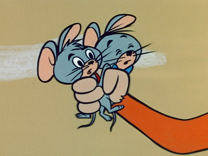
Here’s a six-drawing run cycle. See the curved greyish lines above the legs? Muse does this because the body shapes are on separate cels from the legs. The three body cels are reused to match how the legs are lifted on the left and right side of the meece bodies. Body position 1 is used in drawings 1 and 4, body position 2 in drawings 2 and 5, and body position 3 in drawings 3 and 6. Something difficult to tell below is the meeces are higher in the frame in some shots than others, enhancing the movement.
It’s an awkward description but I hope you get my point.


When you’re churning out footage, niceties such as having the characters in the same position when a shot changes from close to medium are tossed out. That takes planning. Planning takes time. Time slows down the footage count. Here are two examples. These are consecutive frames. The backgrounds don’t even match.


This is one of 66 cartoons made in the first season of the Huck show. Muse animated 29 of them (with assistance by Lah on some). I understand he was paid by the foot, so you can’t blame him for trying to maximise his footage. But, and it’s an age-old lament, you can’t help but wonder how much better the cartoons might have looked if there had been more time to work on them. On the other hand, kids, teenagers and adults laughed at them anyway and made the Huck show a brief, Emmy-winning, cult favourite through the late ‘50s.
Whenever I see a new post from you I get very excited - like a kid on Christmas morning. Thank you, they're much appreciated!
ReplyDeleteI do,too!
DeleteIndeed Daws and Don *did* carry those stationary scenes. Two masters at their craft.
ReplyDeleteGREAT post!
ReplyDeleteYour last paragraph got me thinking. Indeed, how much better could these have been with time spent on them. But, as you say, people laughed, money was made, job complete.
And yet...
Maybe that's it. They were only good enough to be watched that one broadcast. Because no time was spent making them better, they never achieved the depth of artistry to warrant being timeless classics.
I mean, I AM here talking about them. Love the characters. Love the character designs. The backgrounds as static images drawn with years of experience behind them. Love the painterly effect that was carried over to the Golden books. And the very, very strong overlay of my nostalgia keeps them in my heart.
But, wow, I could never stand watching this "animation" ever again. It's so bad. And it didn't have to be. Stronger posing would've at least made it dynamic. The characters didn't have to be so darn... flat. Not expecting the roundness and volume of Disney but it didn't evolve or carry into the graphic design of UPA either. Just this watered down middle ground of lowered expectations.
like ah---yeeouch ! you ripped them meeces to pieces ! but everything you said is true. it's the "if only" syndrome. who'da thunk there would've been home video to study each frame ? daws & don messick-what treasures both. they conjure up movement with their audio contributions. bad voice actors stand out like jinksey's sore throbbing thumb bashed with a hammer. oouch ouch eech !
Delete